After completing my boot camp, I was eager to sharpen my design skills by offering assistance to restaurants in improving their websites. This led me to collaborate with Mike’s Noodle House, where I designed their website to prioritize visuals and provide comprehensive food allergen information based on insightful interactions with the owner and patrons.
A new website for a restaurant aimed at streamlining orders and provide easy access to allergen information
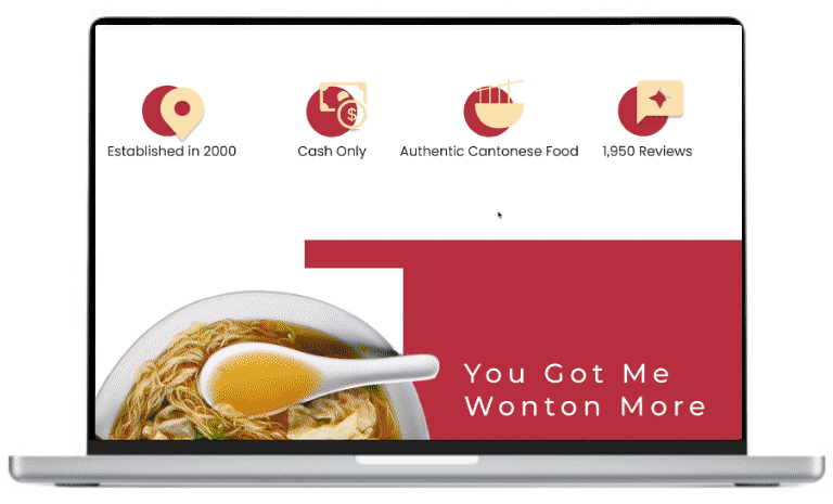
Mike’s Noodle House
Project Overview
Project Type: Client Project
Methods:
Tools Used: Figma, Maze, Draw.io
Research: User Interviews, Affinity Mapping, Persona, Sitemap, Usability Test, Competitive Analysis, User Flow
My Role: Researcher & UX/UI Designer
Duration: 6-months
Problem Context
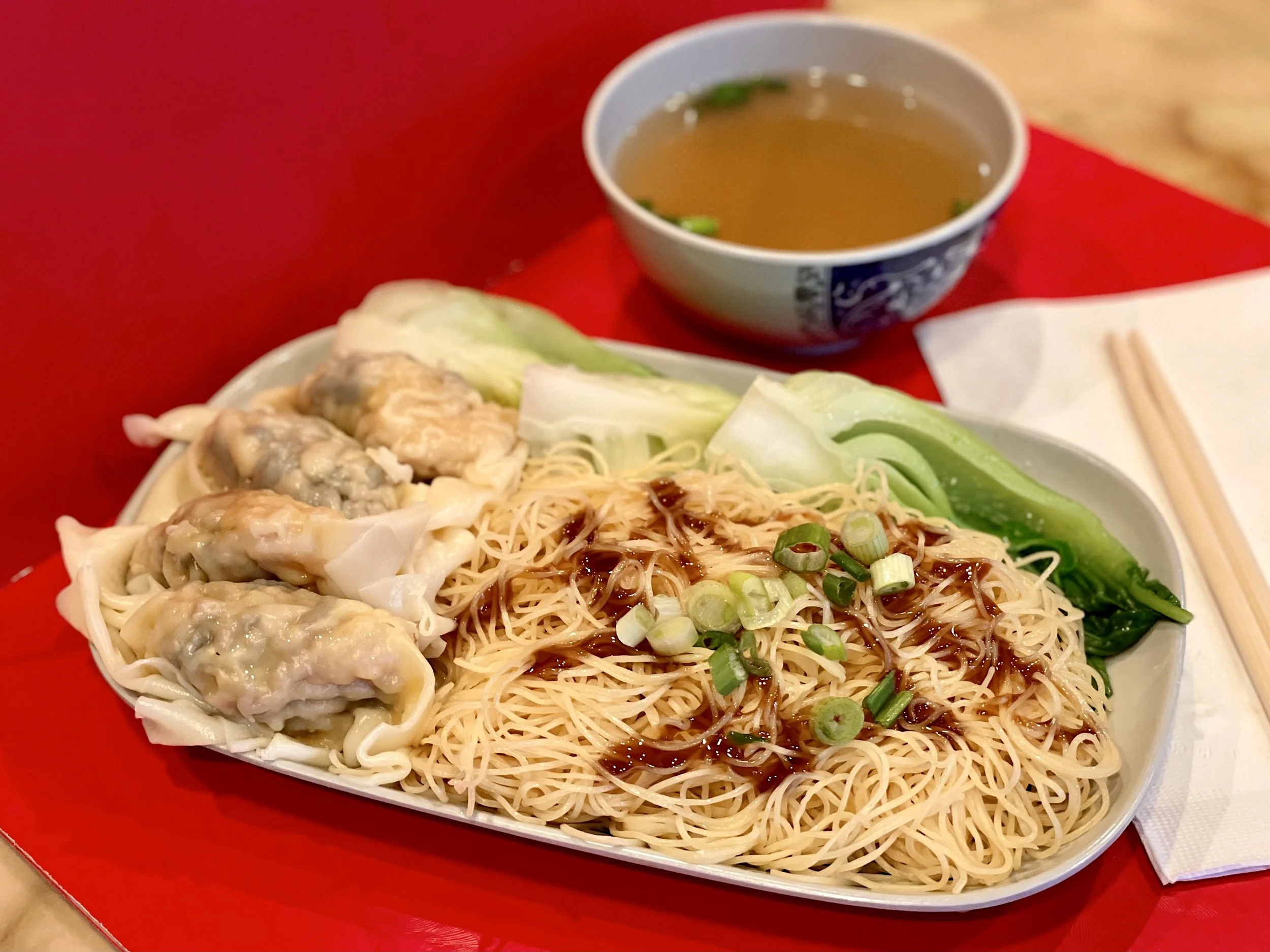
Customers of Mike’s Noodle House love grabbing a quick bite of bouncy noodles in a savory broth.
However, many have been complaining about not being able to view the menu online. Before they eat at a restaurant or order online, customers want to view the allergens, prices, and pictures. It’s important for them to know more about the restaurant and its dishes before they place their orders.
Keeping the objectives in mind

Understand the customer's needs and pain points when viewing the menu

Uncover the client’s motivation behind the website design

Conduct competitive analysis and integrate features into the design
Quick solution overview
Food Description & Allergen Information
A brief description beneath the item picture will help users who may not be familiar with the item or would like to know the ingredients. On the right side of the page, users will also find a list of allergens present in the dish. The icons represent the allergens present in the dish, allowing users to find dishes that suit their dietary restrictions.

Payment Method
Mike's Noodle House is a "Cash Only" establishment, but there are no signs that make it clear. It is important to post "Cash Only" everywhere on the website to remind customers to bring cash when picking up their orders and reduce frustration when it is time to pay.

Uncovering user insights and pain points
To learn more about the customer’s needs and goals, I went over to Mike’s Noodle House and interviewed five people about their experiences viewing online restaurant menus and finding food that meets their dietary needs. In my interviews, I discovered interesting findings that have influenced my design choices and the features I have chosen.
To recap the user interviews, I identified four key takeaways:
5/5
Preferred a website that uses lots of pictures to highlight the dishes
Seeing a visual representation of a dish allows customers to see the ingredients and the overall appeal.
4/5
Found that the preferred method of payment was not apparent
Mike’s Noodle House is a cash-only restaurant and users did not receive a heads-up beforehand.
5/5
Dislikes excessive text and buttons leading to distractions
An abundance of text and buttons may impede customers' ability to find what they need on a website.
4/5
Needed a menu with descriptive information about the dishes
Due to dietary restrictions, many customers struggled to choose dishes from the menu.
Putting the pieces together and synthesizing the data
Based on the interview data, I would like to highlight the features that address the lack of information and confusion concerning payment methods.
Customers have trouble figuring out the ingredients and how it is prepared
Customers do not realize it is a “Cash Only” restaurant until its time to pay
Pain Points
Description of the dishes
An overview of allergens
“Cash Only” reminders
Key Features
Provides more details into the ingredients and work that goes into a dish
Gives trust and comfort to customers who have allergies
Gently remind guest that the restaurant is “Cash Only”
Motivations
Tracing the steps
Using the features as a guide, I designed a flow diagram of how the user could navigate through the website to order food on an external website or contact the restaurant for take-out.
Please click on the user flow to zoom in
Testing the waters with users
In order to evaluate the application's flow and functionality, I tested the mid-fi wireframes. For my usability test, I set up an online platform called Maze where I asked 5 users to test the wireframes. While 100% of the participants completed the task successfully, I received feedback that led to some design changes.
01. Rectangular block images are too small
The rectangular block images are currently too small, making it challenging for users to see the details of the image clearly. They suggest enlarging the pictures for improved visibility.

02. Difficult to read text on top of images on the menu
Users have observed that the text overlaid on top of images lacks sufficient contrast, making it difficult to read.

03. Font size on the ordering page is too small
Feedback from users highlights that the font size for the text "Call Us for To-Go" is too small, resulting in readability issues. Increasing the font size would enhance clarity and legibility.

Designing for consistency
To ensure consistency in website development, I developed guidelines that can be used by developers and designers. It is more cost-effective and time-saving to repurpose existing patterns and components instead of creating them from scratch.
Helping local businesses one step at a time
Introducing the new website for Mike’s Noodle House! Users can now view both pictures and descriptions of dishes to address allergy concerns, ensuring confident ordering. We've emphasized cash payments throughout the site to reduce last-minute frustrations during pickup. Explore the improved design of Mike’s Noodle House today!
Food Description & Allergen Information
Adding a brief item description below pictures helps customers who are unsure about ingredients and allergen information.
Interview findings showed user struggles with dish selection due to dietary restrictions. To address this, dishes include ingredient details, preparation methods, and allergen information to guide users while ordering.
Payment Method
To ensure clarity for the customers, it's essential to prominently display "Cash Only" on Mike's Noodle House's website, reminding them to bring cash for order pickups. Despite customer dissatisfaction, negotiating with the owner to use card payment was unsuccessful. However, proposing to post "Cash Only" across the website offers a practical workaround.
Impact
20% increase in online orders & 35% increase in customer satisfaction
Two weeks after the grand reveal of the restaurant's revamped website, we conducted a customer survey and collaborated with the owner to gauge its impact. The findings were impressive, revealing a remarkable 20% surge in online order system usage and a notable 35% increase in overall customer satisfaction with the online menu.
Reflection & Next Steps
I've enjoyed creating this website, particularly seeing the client's excitement. Balancing their needs was challenging, but we reached a satisfying agreement on the design. Now, I'm eager for the client to proceed with development. If time allowed, I'd explore testing more features.
1. Test Out a New Rating Feature
Adding a ratings and testimonials section on the "Items Detail" page builds trust and helps customers feel confident in their orders. If I had more time, I would implement this on my mid-fi, test its functionality with users, and survey their interest in and the benefits of this feature for their website experience.
2. Test the “Category Selection” Filter on the Menu
I didn't have time to test the "Category Selection" filter on the menu, where customers can click to jump to a specific section. An A/B test comparing this feature to a drop-down menu would help determine the most efficient and user-friendly option.
Thank you for reading through my case study
If you are in the Seattle area, please go check-out Mike’s Noodle House for their delicious Cantonese style dishes!