
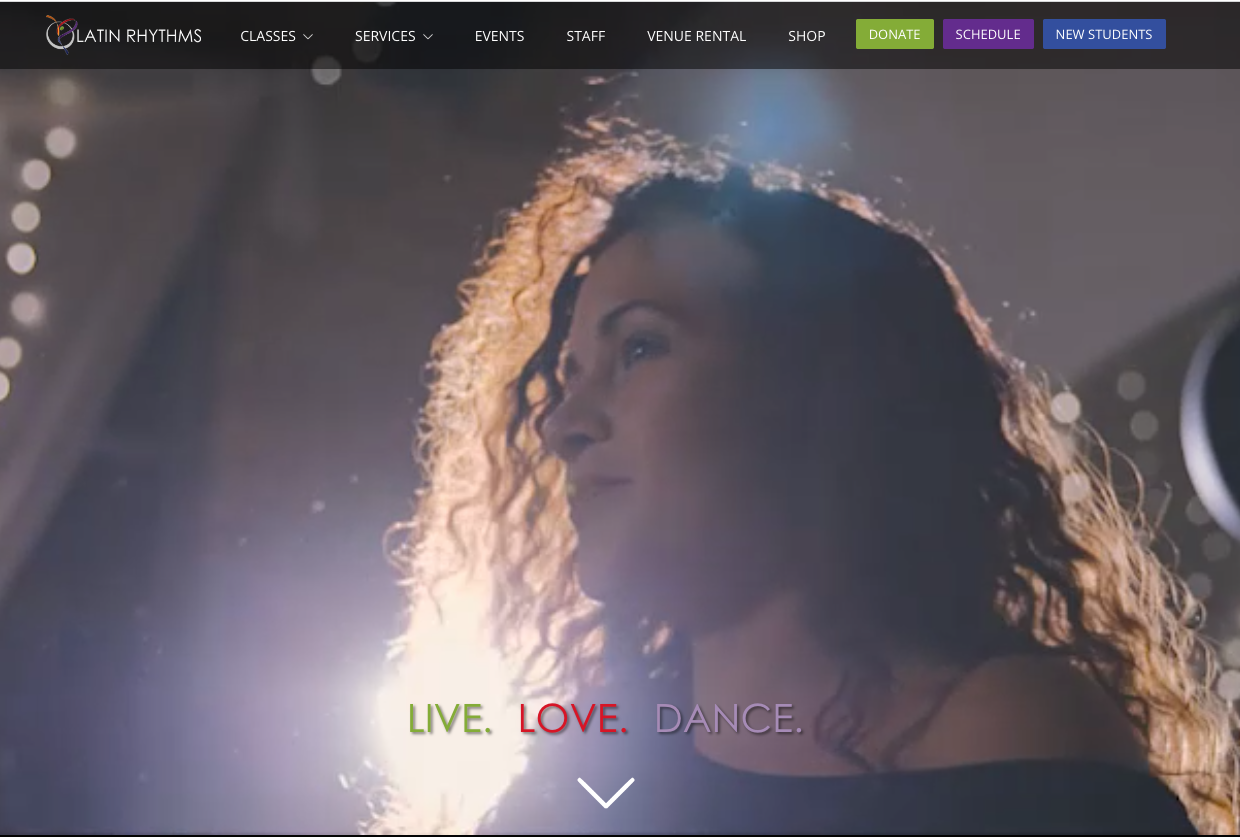
May I Have This Dance
A Dance Studio’s Website Redesign
May I Have This Dance is a dance studio on the northwest side of Chicago. May I Have This Dance offers many dance classes, boot camps, and dance events that bring the community together! My team and I had a great time learning about how the users navigate the website and revamping their experience.
Project Overview
Project Type: Client Project
Methods:
Tools Used: Figma, Miro, Maze, Draw.io
Research: Screener Survey, Card Sorting, User Interviews, Affinity Mapping, Moscow Map, Persona, Sitemap, Competitive Analysis, Usability Test, User Flow
Duration: 6-months
My Role: Researcher & UX/UI Designer
Team:
Minnie Li: Researcher & UX/UI Designer
Amanda: Researcher & UX/UI Designer
Kat: Researcher
Daniel: UX/UI Designer
Problem Context
Dancers at May I Have This Dance love enjoying themselves at the studio. May I Have This Dance connects the community together by spreading the joy of dancing.
Despite the fun dance studio, users have a hard time navigating the May I Have This Dance website. Users are frustrated by the website and schedule page and find it difficult to find the class information.
How might we reduce users’ frustrations when visiting the MIHTD website and schedule page?

My project goals

Learn about how the students at May I Have This Dance navigate the website
Research competitor websites and implement features into the redesign
Explore the structure of May I Have This Dance and why people love the studio
Aligning it with business goals
Improve the website's user flow by achieving a 20% reduction in drop-offs at critical user flow points within the next six months
Enhance website components to attain a 15% growth in dance class sign-up rates over the next five months
Quick features overview
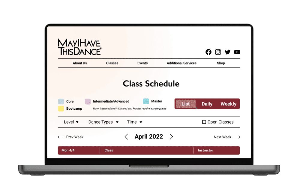
Class Schedule
The redesigned website of May I Have This Dance makes it simple for users to look at the weekly and daily schedules. Users can switch between different perspectives such as list, daily, and weekly views.
No more dense information on the page. Whenever a user clicks on a class, it will bring up a pop-up with more information. View a quick snapshot of the class details or click on “More Info” to explore the class more in-depth.
Class Information
The class information page gives insightful information about the dance class such as price, instructor, location, and description.
With just a few taps, users can register for the class on the website and pay for the course.
The process from beginning to end
Interviews
Competitive Analysis
User Pain Points
User Goals
01
Discover
Affinity Map
User Persona
User Flow
Card Sort
Site Map
Define
02
Low-Fidelity Sketches
Wireframing
Prototyping
Style Guide
03
Design
Usability Test
Iterations & Implementation
04
Test
High-Fidelity Prototype
Final Screens
05
Deliver
Seeking out students and uncovering pain points
To dive deep into the problem at May I Have This Dance, my team and I wanted to learn about the core of the studio and the student's experiences with the website. We interviewed 6 students asking them about the pain and pleasure points of the website.
After synthesizing the interviews through making an affinity map, we found 3 main takeaways:
6/6
Overwhelmed by the dense information on the website

Users were not happy about the text-heavy website, it distracted them from finding the class schedule and studio information.
3/6
Confused about the different external domains

Many of the interviewees would prefer website that incorporated the dance schedule, registration, and merchandise page.
4/6
Wanted an up-to-date website and class schedule

It was difficult for students to switch between the Facebook page and the external website to view the class schedule.
Key features to integrate into final product
Using the data from the interviews, I want to highlight the key features that address the issue of accessing the schedule page and signing up for the class. I will use the list of key features as a guide for my design decisions, while also taking an overall look at the tools.
Too much text on the schedule page
Unclear class description that led to confusion
Pain Points
Different perspectives to view the schedule
Explore the background behind a dance
Gives emotional appeal
Key Features
Class schedule with view changes
Class information (Class Description and Time)
User testimonials
Motivations
Capturing each individual step
To visualize the path a user takes to find a class, we made a diagram of the “happy path”. It's important to look at the overall picture and the decisions a user will make when finding a dance class. We can refer back to the user flow when we start our design process in the next phase.
Please click on the user flow to zoom in.
Discovering key findings from usability testing
With the wireframes completed, we used a tool called Maze to set up our usability test. We asked users to go through four tasks to test the flow and functionality of our wireframes. All the users were able to complete the task successfully, but we received feedback that inspired changes in our design. These are the tasks that we asked our users to complete:
1st: Find the Class Schedule Page
2nd: Adjust the Schedule Through Different State Changes
3rd: Select a Dance to View Class Information
4th: Register for a Class
Choosing the color palette and fonts
Before working on the final solution, my team and I created a style guide to make sure we were consistent with the colors, typefaces, and components throughout all the pages. Students at the studio described the environment as welcoming, friendly, passionate, educational, and fun.
Streamlining the process at May I Have This Dance
Meet the new and improved version of May I Have This Dance! To address the pain points of finding and viewing the class schedule, users can adjust the schedule through a list, weekly, and daily views. With a glance, users can get a quick snapshot of the class information and see which classes they can attend. Check out our redesign of May I Have This Dance!
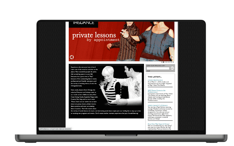
Original Website
Many users from the interview mentioned that the website is too cluttered with text. As a result of a text-heavy website, users had a hard time finding the class schedule and dance information.
Newly Redesigned Website
In our project, we focused on the schedule pages since that was the biggest concern among our users. The newly redesigned website allows users to adjust class schedules through the list, daily, and weekly views. Users will be able to find their classes more easily without having to scroll through a cluttered list of text.
Reflection & Next Steps
As I reflect back on this project, I am proud of our team for working with such a passionate client. Although there were some miscommunications and speed bumps along the way, we were able to smooth it out by voicing our ideas and advocating for UX. We definitely met our client’s expectations and I cannot wait for him to take our design to developers! If we had more time, we would have:
1. Test the daily class schedule view
We didn't have time to test out the daily view because it was only implemented in our high-fi. My team and I would like to conduct A/B testing on the daily view vs. weekly view to understand which page performs better and adds value to the website.
2. Test the filtering system on the class schedule page
With so many different factors that make up a schedule, my team and I would conduct another usability test for the class filters. This will allow us to differentiate which filters are beneficial to users and which will hinder them from finding classes.